Building a data visualization app with Streamlit#
When working with data, having a way to interactively explore the dataset is often essential in order to understand and interpret the data. Furthermore, interactive visualizations are a great way to communicate with non-technical people about the main findings.
Jupyter notebooks#
Jupyter notebooks are a great tool for exploring the data, and together with the help of packages like Widgets, it is also possible to make impressive interactive visualizations. With that being said, Jupyter Notebooks still require some level of programming. Furthermore, the code written to make visualizations in a Jupyter Notebook will, in general, be visible within the notebook. It is possible, with some manipulation, to hide the code cells while maintaining the output. Nonetheless, in general, code blocks can contain distractions for the public at which the visualizations were aimed, who might depend on the presented data to make decisions. In these situations, it might be advantageous to present the data in a format that is both interactive and that hides details about the implementation.
Tools for building interactive data visualizations#
Several tools have been made for creating interactive data visualizations. One example is Dash, which is built on top of the Plotly plotting library. Another popular choice is Voilà, which essentially takes a Jupyter notebook and turns it into a web application.
We will here take a closer look at a library called Streamlit
Streamlit#
Before we can use streamlit, we need to install it. This can be done using pip, as usual
python -m pip install streamlit
For more information about Streamlit installation, we refer to the installation instructions.
Once the library is installed, one should have access to it via the command line.
$ streamlit --version
Running the above command should display the version of Streamlit installed on the local machine. The one used at the time of writing is version 1.13.0.
A help menu can also be displayed by running streamlit with the --help flag.
$ streamlit --help
Usage: streamlit [OPTIONS] COMMAND [ARGS]...

  Try out a demo with:

      $ streamlit hello

  Or use the line below to run your own script:

      $ streamlit run your_script.py

Options:
  --log_level [error|warning|info|debug]
  --version                       Show the version and exit.
  --help                          Show this message and exit.

Commands:
  activate  Activate Streamlit by entering your email.
  cache     Manage the Streamlit cache.
  config    Manage Streamlit's config settings.
  docs      Show help in browser.
  hello     Runs the Hello World script.
  help      Print this help message.
  run       Run a Python script, piping stderr to Streamlit.
  version   Print Streamlit's version number.
One can also try out the built-in demo using
$ streamlit hello

  Welcome to Streamlit. Check out our demo in your browser.

  Local URL: http://localhost:8501
  Network URL: http://192.168.0.98:8501

  Ready to create your own Python apps super quickly?
  Head over to https://docs.streamlit.io

  May you create awesome apps!
We see that Streamlit will start a web server running on port 8501. In other words, accessing the URL http://localhost:8501 in the web browser of choice should redirect to a page similar to the figure below
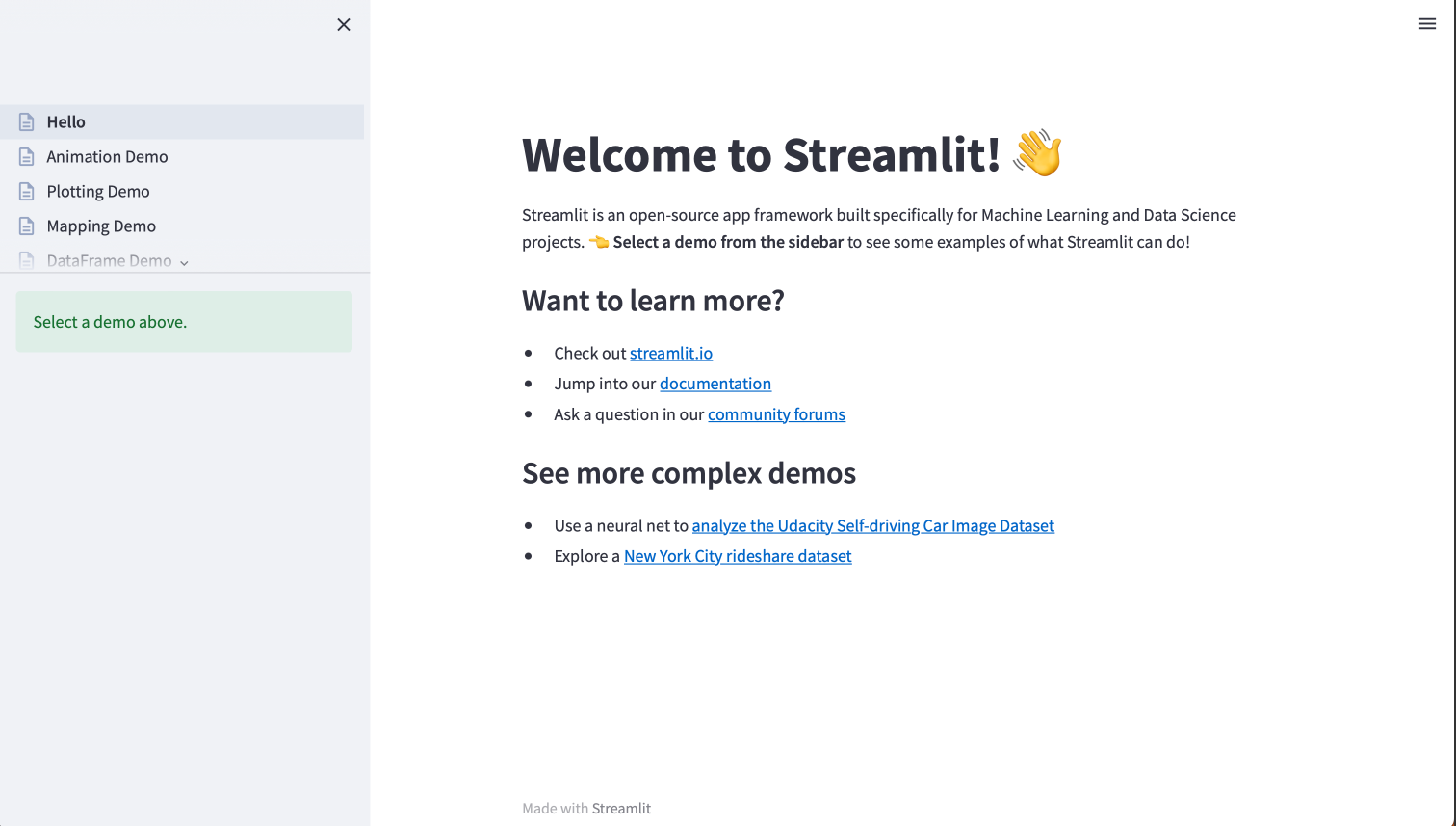
Fig. 46 Streamlit hello app#
A web app to explore Heart failure Data#
We will use a real dataset with heart failure data and create a web application to explore this dataset using Streamlit. The dataset is taken from Kaggle, a website that contains a large collection of open-source datasets used in competitions to create machine learning models. The interesting point about this dataset is that many people have already submitted their analysis of this dataset, making it easy to compare and learn new approaches for analyzing such datasets.
We can download this dataset and read it with pandas (to download it, a Kaggle account should be created in advance). Below, we display some information about the dataset
import pandas as pd

path = "heart.csv"
df = pd.read_csv(path)
df.info()
<class 'pandas.core.frame.DataFrame'>
RangeIndex: 918 entries, 0 to 917
Data columns (total 12 columns):
 #   Column          Non-Null Count  Dtype
---  ------          --------------  -----
 0   Age             918 non-null    int64
 1   Sex             918 non-null    object
 2   ChestPainType   918 non-null    object
 3   RestingBP       918 non-null    int64
 4   Cholesterol     918 non-null    int64
 5   FastingBS       918 non-null    int64
 6   RestingECG      918 non-null    object
 7   MaxHR           918 non-null    int64
 8   ExerciseAngina  918 non-null    object
 9   Oldpeak         918 non-null    float64
 10  ST_Slope        918 non-null    object
 11  HeartDisease    918 non-null    int64
dtypes: float64(1), int64(6), object(5)
memory usage: 86.2+ KB
We can also use the .describe method to display some simple statistics about the dataset
df.describe()
| Age | RestingBP | Cholesterol | FastingBS | MaxHR | Oldpeak | HeartDisease | |
|---|---|---|---|---|---|---|---|
| count | 918.000000 | 918.000000 | 918.000000 | 918.000000 | 918.000000 | 918.000000 | 918.000000 |
| mean | 53.510893 | 132.396514 | 198.799564 | 0.233115 | 136.809368 | 0.887364 | 0.553377 |
| std | 9.432617 | 18.514154 | 109.384145 | 0.423046 | 25.460334 | 1.066570 | 0.497414 |
| min | 28.000000 | 0.000000 | 0.000000 | 0.000000 | 60.000000 | -2.600000 | 0.000000 |
| 25% | 47.000000 | 120.000000 | 173.250000 | 0.000000 | 120.000000 | 0.000000 | 0.000000 |
| 50% | 54.000000 | 130.000000 | 223.000000 | 0.000000 | 138.000000 | 0.600000 | 1.000000 |
| 75% | 60.000000 | 140.000000 | 267.000000 | 0.000000 | 156.000000 | 1.500000 | 1.000000 |
| max | 77.000000 | 200.000000 | 603.000000 | 1.000000 | 202.000000 | 6.200000 | 1.000000 |
Creating the first page with Streamlit#
Let us start by creating a very simple application with Streamlit. First, we need to create a file called app.py with the following content
import streamlit as st

st.title("Heart Failure Prediction Dataset")
st.text("This is a web app to allow exploration of heart failure data")
To test the code, we can run the Python file using the following command
streamlit run app.py
A browser should open automatically (if it does not, simply open a browser and go to the URL http://localhost:8502). By changing the text in the Python file and refreshing the browser one should see that the changes take effect.
Let us try to add some more content to the application, by adding the following lines that describe the dataset that we will explore.
st.header("Dataset")
st.markdown(
    """
This dataset is taken from
https://www.kaggle.com/datasets/fedesoriano/heart-failure-prediction

At Kaggle, several authors publish their own code where they
have analyzed the different datasets.

For example, the following review https://www.kaggle.com/code/durgancegaur/a-guide-to-any-classification-problem/notebook
is a pretty good one.
"""
)
Loading the data#
We now want to load the data into the application. We can do this by reading the .csv file into a pandas.DataFrame, from which we can also write the statistics to the application via the following lines
import pandas as pd

df = pd.read_csv("heart.csv")

st.header("Statistics of Dataframe")
st.write(df.describe())
The application should now look similar to the following figure
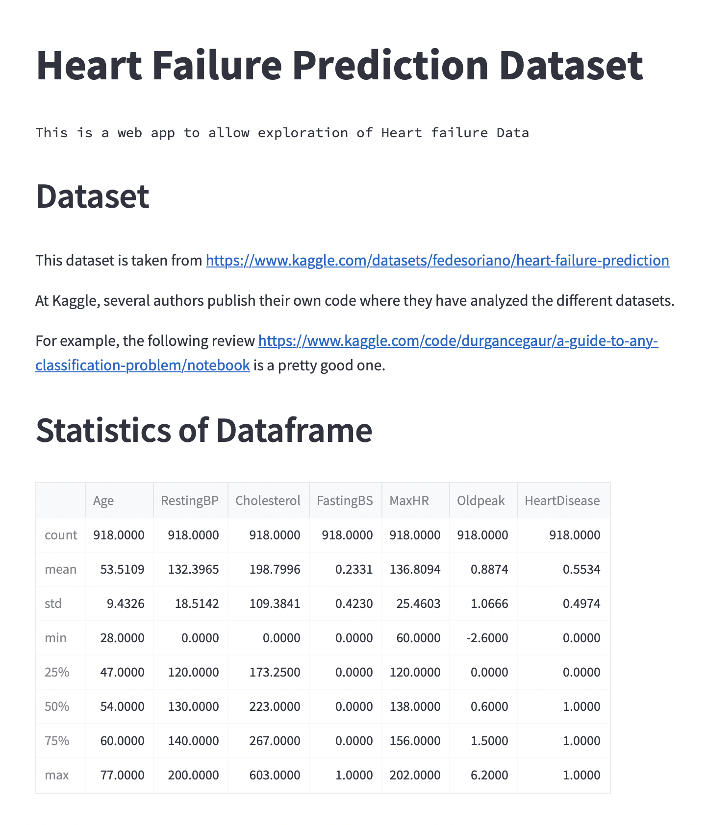
Fig. 47 Current version of the web application.#
Creating different pages#
We would now like to display different pages when clicking on the different radio buttons. We can do this by having an if test at the end of the script and running a different function based on the value of options. For example
if options == "About":
    show_about_page()
elif options == "Data Summary":
    show_data_summary_page()
elif options == "Data Header":
    show_data_header_page()
Subsequently, we can wrap the about page and data summary into separate functions. Here we have also added a page to show the head of the DataFrame.
The full code currently looks as follows
import streamlit as st
import pandas as pd

st.title("Heart Failure Prediction Dataset")
st.text("This is a web app to allow exploration of Heart failure Data")


def show_about_page():
    st.header("Dataset")
    st.markdown(
        """
    This dataset is taken from
    https://www.kaggle.com/datasets/fedesoriano/heart-failure-prediction

    At Kaggle, several authors publish their own code where they
    have analyzed the different datasets.

    For example, the following review https://www.kaggle.com/code/durgancegaur/a-guide-to-any-classification-problem/notebook
    is a pretty good one.
    """
    )


df = pd.read_csv("heart.csv")


def show_data_summary_page():
    st.header("Statistics of DataFrame")
    st.write(df.describe())


def show_data_header_page():
    st.header("Header of DataFrame")
    st.write(df.head())


st.sidebar.title("Navigation")
options = st.sidebar.radio(
    "Select what you want to display:",
    [
        "About",
        "Data Summary",
        "Data Header",
    ],
)
if options == "About":
    show_about_page()
elif options == "Data Summary":
    show_data_summary_page()
elif options == "Data Header":
    show_data_header_page()
At this point, it should be possible to change the viewing page using the radio buttons.
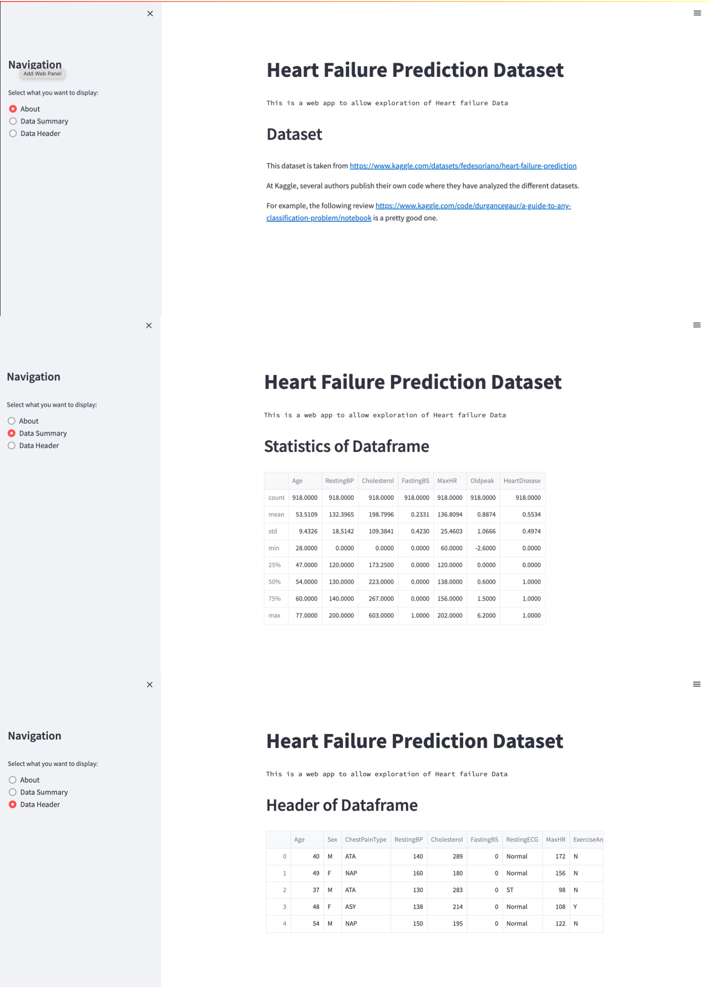
Fig. 48 Current version of the web application with sidebar and three pages.#
Plotting with Matplotlib#
Being able to plot the data will give another way of exploring the data. Given that Matplotlib was previously discussed in Analyzing data with pandas and matplotlib, this is going to be our tool of choice for creating simple visualizations of the data. Later we will look at another visualization library called Plotly, which is better suited for creating interactive visualizations.
In order to use Matplotlib we need to first import it
import matplotlib.pyplot as plt
To make things simple, let us assume that we want to plot maximum heart rate as a function of age. We can create such as plot using the following code snippet
fig, ax = plt.subplots()
ax.scatter(x=df["Age"], y=df["MaxHR"])
ax.grid()
ax.set_xlabel("Age")
ax.set_ylabel("MaxHR")
In order to display this in the web application, we need to pass the Matplotlib figure into Streamlit. We do this using the pyplot method.
We can wrap this code into a new function called plot_mpl
def plot_mpl():
    st.header("Plot of Data")

    fig, ax = plt.subplots()
    ax.scatter(x=df["Age"], y=df["MaxHR"])
    ax.grid()
    ax.set_xlabel("Age")
    ax.set_ylabel("MaxHR")

    st.pyplot(fig)
We can create a new page called "Scatter Plot" that can be selected select in the sidebar
options = st.sidebar.radio(
    "Select what you want to display:",
    [
        "About",
        "Data Summary",
        "Data Header",
        "Scatter Plot",
    ],
)

if options == "About":
    about()
elif options == "Data Summary":
    data_summary(df)
elif options == "Data Header":
    data_header(df)
elif options == "Scatter Plot":
    plot_mpl(df)
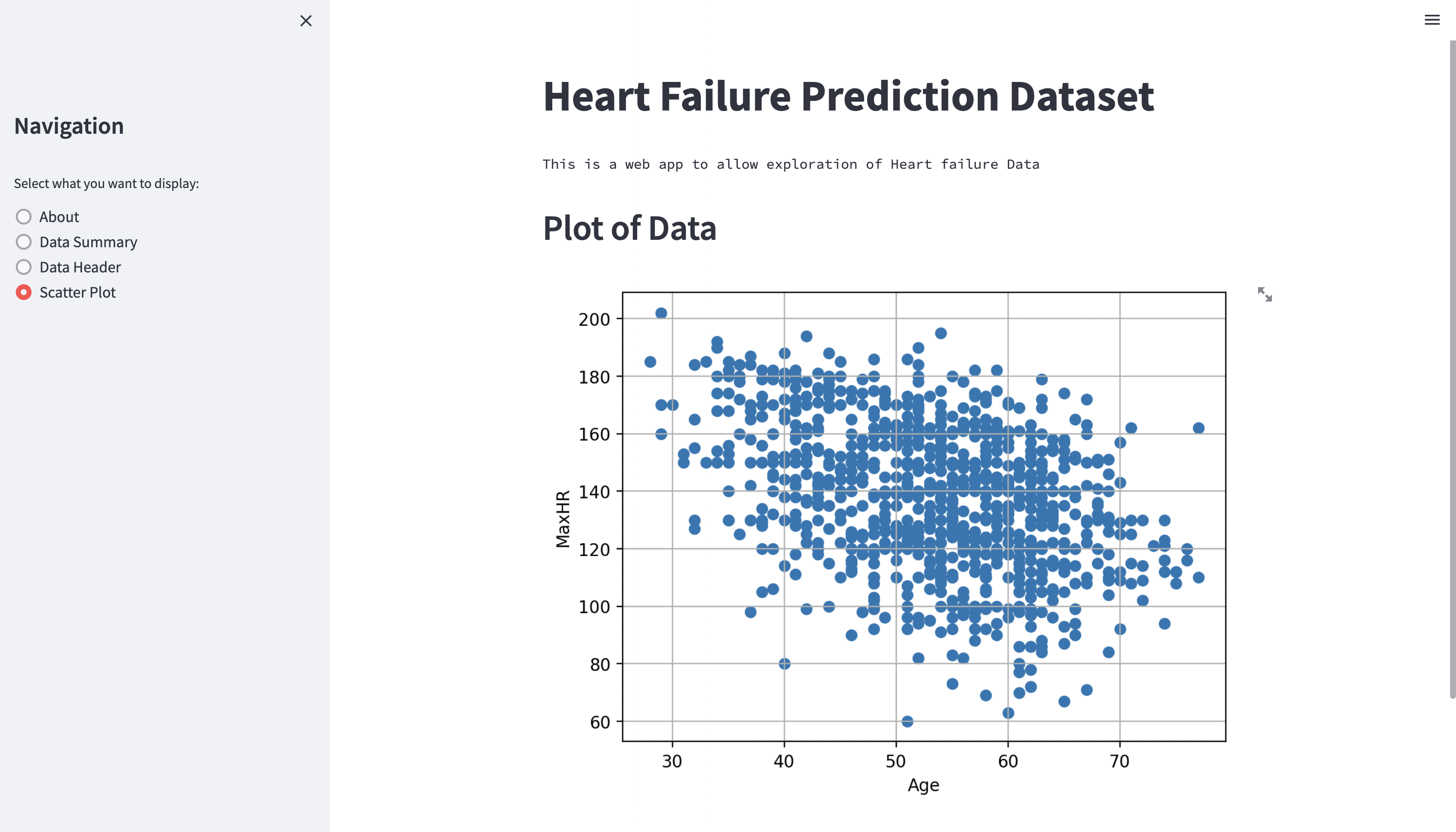
Fig. 49 Plotting with Matplotlib.#
Plotting with Plotly express#
Matplotlib is great for plotting and especially useful for creating figures for reports. However, other libraries are better suited for interactive visualizations. One of these libraries is Plotly which is built on top of a Javascript library called plotly.js. Here we will use a sub-package of Plotly called plotly.express which is a simplified version of the Plotly library.
To use plotly.express we need to first import it, and it is common to import it as px
import plotly.express as px
Before we start plotting anything, let us create a new page in our web application. In this example, we would like to plot the distribution of a single column as a histogram. This can be useful in order to see, for example, the ages of the people included in this study.
Let us create a new method called single_column where we can start by simply writing some text
def single_column():
    st.header("Single Column")
With that, we also add a new option to the sidebar
options = st.sidebar.radio(
    "Select what you want to display:",
    [
        "About",
        "Data Summary",
        "Data Header",
        "Scatter Plot",
        "Single Column",
    ],
)
Finally, as we are already used to, we add an if-test to call this method
if options == "About":
    show_about_page()
elif options == "Data Summary":
    show_data_summary_page()
elif options == "Data Header":
    show_data_header_page()
elif options == "Scatter Plot":
    plot_mpl()
elif options == "Single Column":
    single_column()
After this, a new radio button in the sidebar named Single Column should be displayed, and when clicked will show the text Single Column.
Creating a histogram#
We can create a histogram over all the ages by passing in the DataFrame and the key "Age" to the histogram function in plotly.express as follows
plot = px.histogram(df, x="Age")
To add this plot to Streamlit, we can use the plotly_chart function
st.plotly_chart(plot)
After adding these two lines of code to the function single_column, we are able to see a histogram of all the ages in the dataset
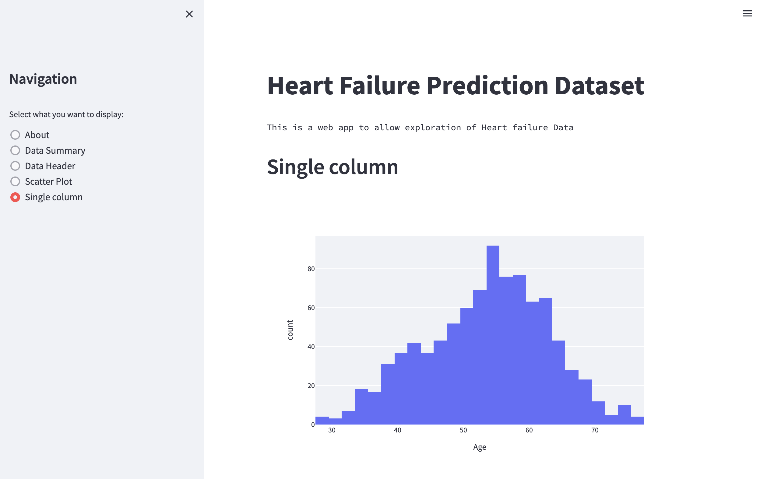
Fig. 50 Plotting histogram of all the ages using Plotly Express.#
Adding a select box to select different columns#
Currently, we have hard-coded the key "Age" as the column to be used in the histogram. However, this is neither very robust nor flexible. Instead, we would like the user to be able to select any of the columns of the dataset they desire to see a histogram of.
One way to do this is to create a select box in Streamlit and set the options to the columns in the DataFrame
column = st.selectbox("Select column", options=df.columns)
Instead of passing the column "Age" we can pass in the column selected via the select box
plot = px.histogram(df, x=column, use_container_width=True)
Here we have also set use_container_width=True so that the figure scales properly with the width of the application.
We are now able to select a column, and the plot should update accordingly
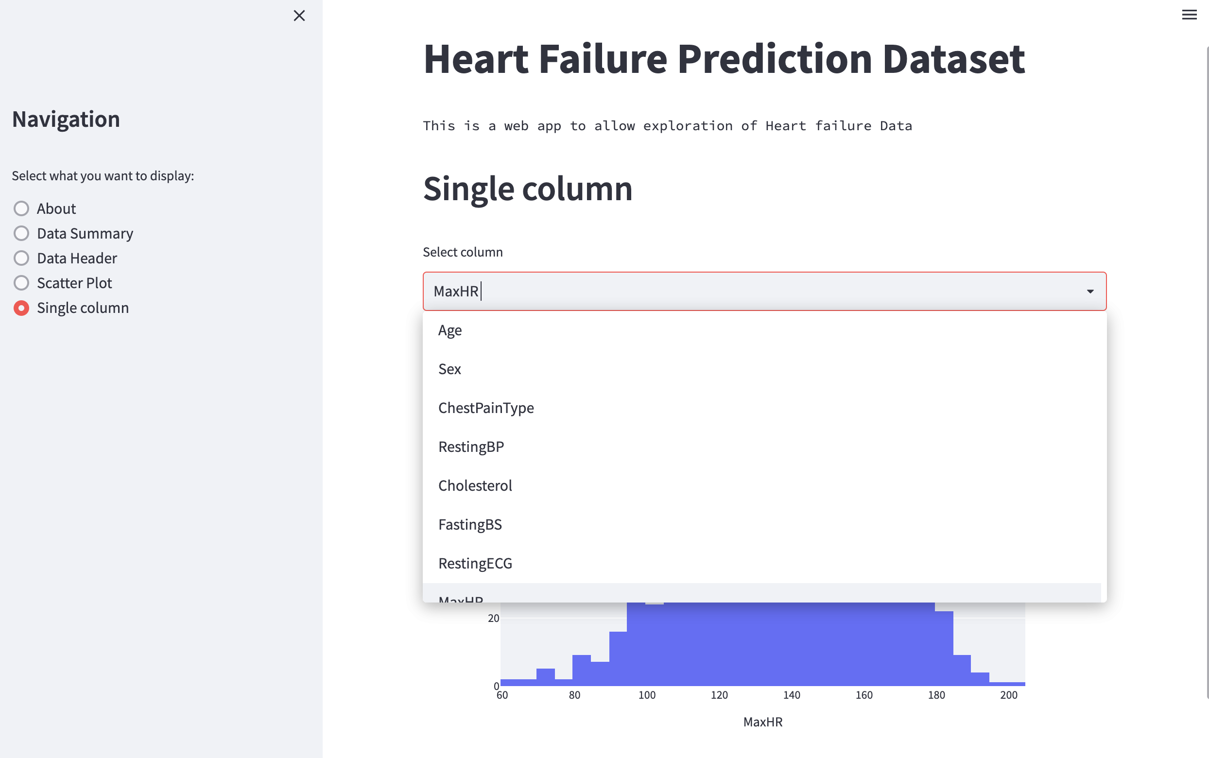
Fig. 51 Plotting histogram with select box using Plotly Express.#
Plotting two columns#
Plotting a histogram of one column is useful, but it is also interesting to plot one column against another (such as the scatter plot we plotted with Matplotlib). Now that we have learned how to create a select box, it should be no problem to create two select boxes to choose the data to be plotted on the X- and Y-axis.
Let us create a radio button with the label Two columns and a corresponding two_columns function with the following content
def two_columns():
    col1, col2 = st.columns(2)

    x_axis_val = col1.selectbox("Select the X-axis", options=df.columns)
    y_axis_val = col2.selectbox("Select the Y-axis", options=df.columns)

    plot_type = st.selectbox("Select plot type", options=["scatter", "box"])

    if plot_type == "scatter":
        plot = px.scatter(df, x=x_axis_val, y=y_axis_val)
    elif plot_type == "box":
        plot = px.box(df, x=x_axis_val, y=y_axis_val)

    st.plotly_chart(plot, use_container_width=True)
In the code above, we first create two select boxes for the columns to be plotted on the X- and Y-axis. Afterward, we create another select box through which the user can select the type of plot to be displayed (i.e., a scatter plot or a box plot), and finally, we plot the data and add the plot to Streamlit.
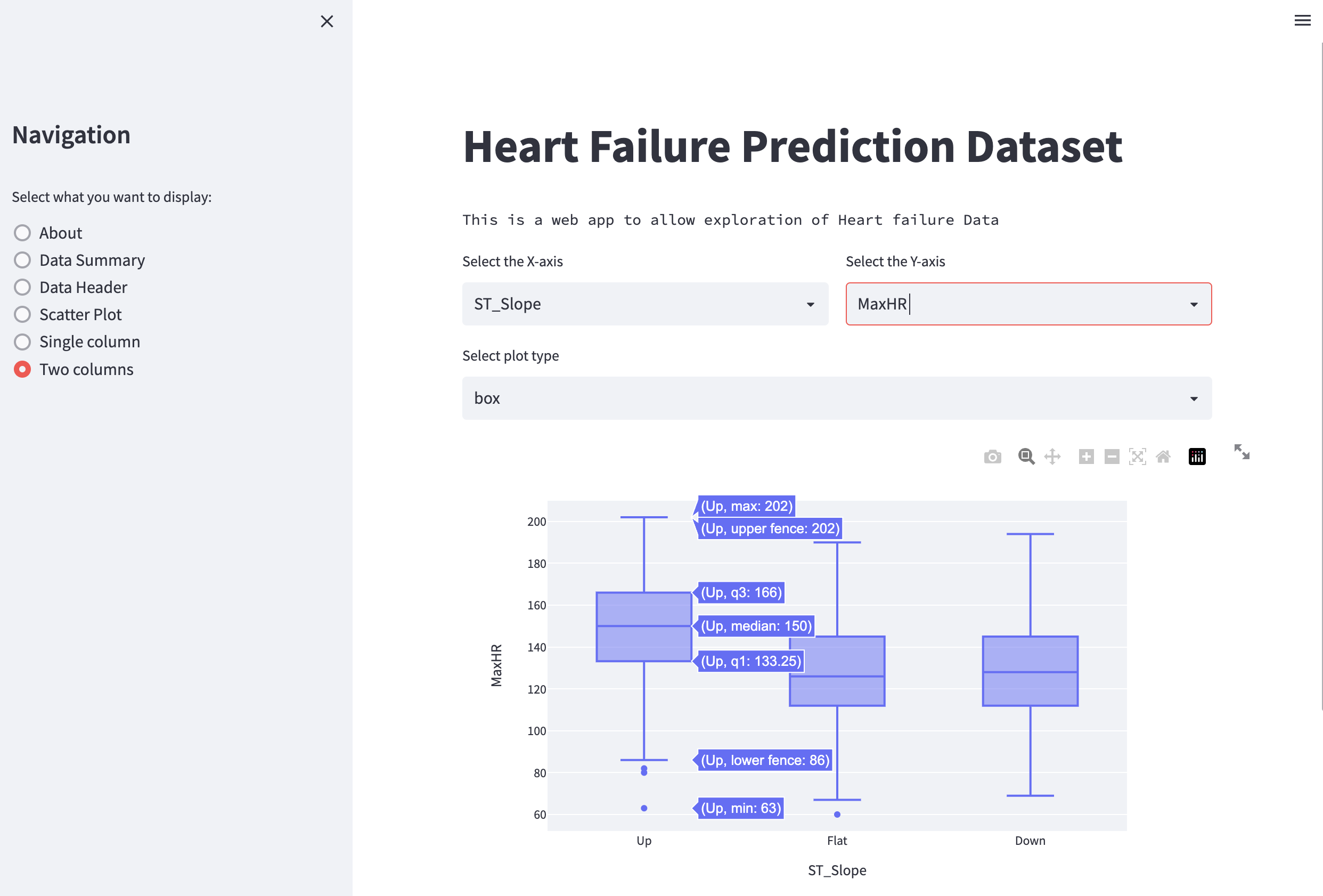
Fig. 52 Plotting two columns with Plotly Express.#
Final code#
Below is the final code of the whole web application. Here we also updated the functions to take the DataFrame as an argument, making more explicit what data is used.
# app.py

import streamlit as st
import pandas as pd
import matplotlib.pyplot as plt

import plotly.express as px

st.set_page_config(layout="wide")


def about():
    st.header("Dataset")
    st.markdown(
        """
    This dataset is taken from
    https://www.kaggle.com/datasets/fedesoriano/heart-failure-prediction

    At Kaggle, several authors publish their own code where they
    have analyzed the different datasets.

    For example, the following review https://www.kaggle.com/code/durgancegaur/a-guide-to-any-classification-problem/notebook
    is a pretty good one.
    """
    )


def data_summary(df):
    st.header("Statistics of DataFrame")
    st.write(df.describe())


def data_header(df):
    st.header("Header of DataFrame")
    st.write(df.head())


def plot_mpl(df):
    st.header("Plot of Data")

    fig, ax = plt.subplots()
    ax.scatter(x=df["Age"], y=df["MaxHR"])
    ax.grid()
    ax.set_xlabel("Age")
    ax.set_ylabel("MaxHR")

    st.pyplot(fig)


def single_column(df):

    column = st.selectbox("Select column", options=df.columns)

    plot = px.histogram(df, x=column)
    st.plotly_chart(plot, use_container_width=True)


def two_columns(df):
    col1, col2 = st.columns(2)

    x_axis_val = col1.selectbox("Select the X-axis", options=df.columns)
    y_axis_val = col2.selectbox("Select the Y-axis", options=df.columns)

    plot_type = st.selectbox("Select plot type", options=["scatter", "box"])

    if plot_type == "scatter":
        plot = px.scatter(df, x=x_axis_val, y=y_axis_val)
    elif plot_type == "box":
        plot = px.box(df, x=x_axis_val, y=y_axis_val)

    st.plotly_chart(plot, use_container_width=True)


# Add a title and intro text
st.title("Heart Failure Prediction Dataset")
st.text("This is a web app to allow exploration of Heart failure Data")

# Sidebar setup
# st.sidebar.title("Sidebar")
# upload_file = st.sidebar.file_uploader("Upload a file containing earthquake data")
# Sidebar navigation
st.sidebar.title("Navigation")
options = st.sidebar.radio(
    "Select what you want to display:",
    [
        "About",
        "Data Summary",
        "Data Header",
        "Scatter Plot",
        "Single Column",
        "Two Columns",
    ],
)

# Check if file has been uploaded
df = pd.read_csv("heart.csv")

# Navigation options
if options == "About":
    about()
elif options == "Data Summary":
    data_summary(df)
elif options == "Data Header":
    data_header(df)
elif options == "Scatter Plot":
    plot_mpl(df)
elif options == "Single Column":
    single_column(df)
elif options == "Two Columns":
    two_columns(df)
Summary#
In conclusion, we showed how to use Streamlit to create interactive data visualizations that hide implementation details and are accessible to non-technical users. We explored how to create a Streamlit app using heart failure data from Kaggle and demonstrated how to load and display data via a sidebar with buttons that lead to switchable pages.